SaaS Portal Navigation Redesign
Redesigned a SaaS customer portal to reduce navigation friction, leading to 88% faster task completion and improved user satisfaction.
The Challenge
Our Customer Portal serves as the operational backbone for both internal teams and external stakeholders. However, recurring support tickets and qualitative feedback revealed significant friction in the user experience.
The Executive goal
Transform the portal from a functional tool into a high-efficiency engine by removing navigation hurdles and streamlining core workflows.
The Pain Points
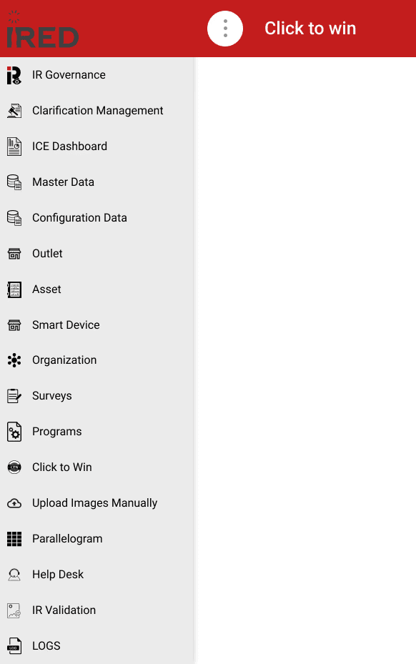
Navigation is 3–4 levels deep and Hierarichal Dropdown
Users rely on memory instead of discoverability
Users take 7–10 minutes to complete frequent tasks

Role, Duration & Platform
Role
Lead UX Designer
Duration
6 Weeks
Platform
Web (SaaS Portal)
Findings in Usability Test
We conducted an unmoderated remote usability test covering several tasks with 5 existing users. The table below shows average results.
Task
Discoverability
Time on Task
Total Clicks
Open Product Master Data
Easy
0m 20s
3
Open Planogram UPC Report
Difficult
4m 30s
11
Edit Scene Type Configuration Scene ID:4523455
Fail
10m
20+
Create Program Item
Difficult
5m 40s
10
Create a List Type Question from Question Library
Difficult
7m
10
For all new users, discoverability largely failed across every task.
User Interviews
To better understand how users navigate the portal in their day-to-day work, we conducted interviews. Below are some representative quotes:
Users are mostly power users who need an efficient way to switch between modules. Some wanted multi-tab functionality, which was available in the legacy portal. The screenshot below shows how users were navigating the portal at that time.

Information Architecture
The existing information architecture was difficult to navigate. It relied on a hierarchical drill-down pattern that was originally designed for new and infrequent users. As the number of modules and the overall workload grew, this approach created significant friction.
We collected all modules and sub-modules to redefine the information architecture. After a thorough review of user roles and access patterns, we iterated on the complete IA using reverse card sorting to organize it into three levels. Certain user groups have access to different modules based on their permissions.
We maintained a collaborative spreadsheet where stakeholders could provide input and propose amendments throughout the process.
After the research phase, we arrived at a persistent navigation pattern with accordions. Using the finalized IA, we created basic wireframes and tested them with users.
Wireframes
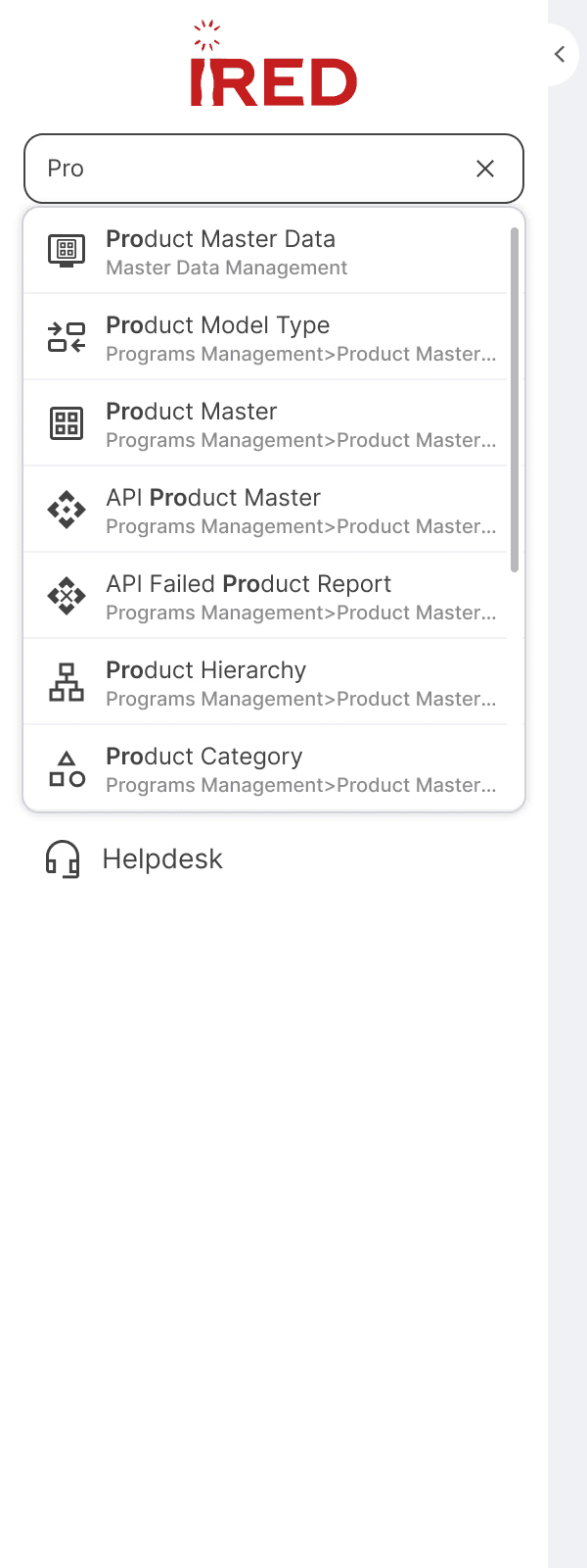
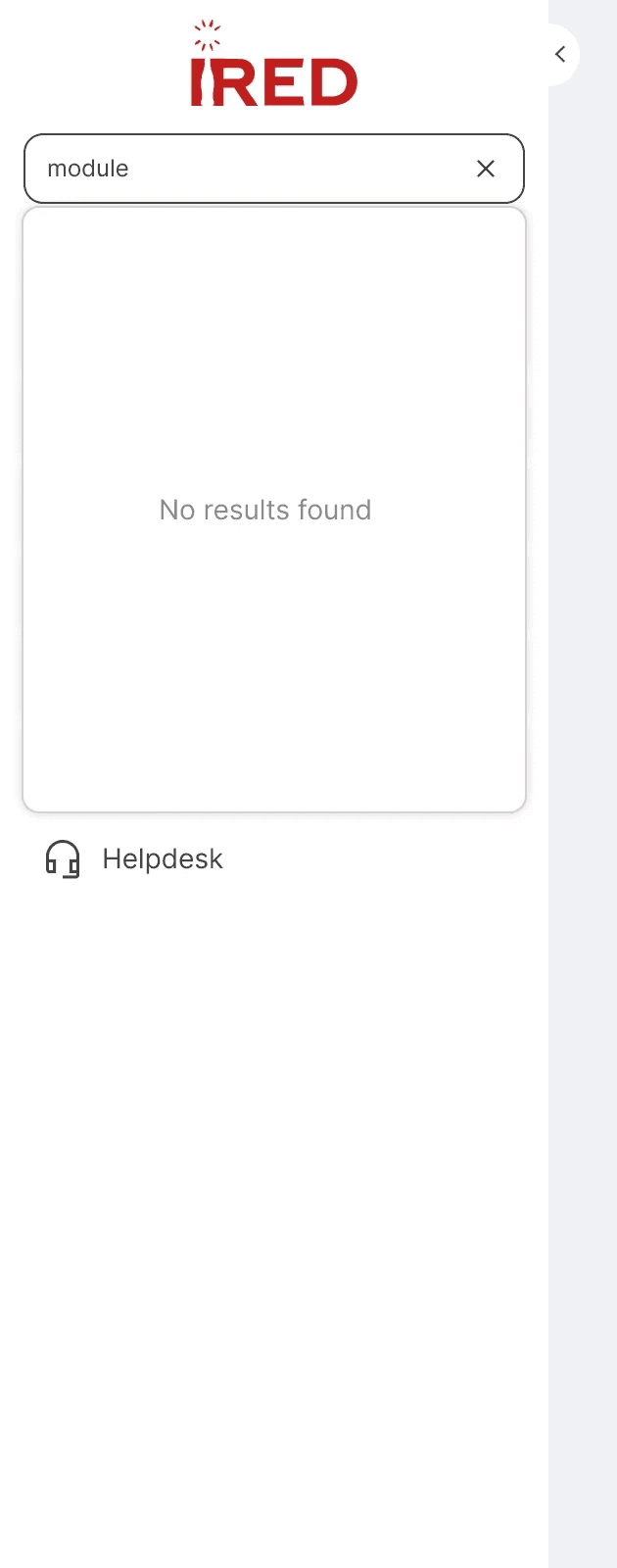
During wireframe testing, users still had difficulty discovering the modules they needed. In response, we introduced a search module feature.

While search offered a faster alternative to manual navigation and improved overall efficiency, it still took users over 10 seconds to find the desired module. Behavioral analysis revealed that most users would type a single character and then scroll through results — a time-consuming approach, primarily because many modules share similar naming conventions, which reduced the effectiveness of short-string searches.
Task
Open Product Master Data
Discoverability
Easy
Finding from Drill Down
0m 5s
Search
0m 5s
Task
Open Planogram UPC Report
Discoverability
Difficult
Finding from Drill Down
0m 50s
Search
0m 15s(Improved)
Task
Open Upload Images Manually
Discoverability
Difficult
Finding from Drill Down
1m 10s
Search
0m 13s(Improved)
Trade-offs & Decisions
Speed vs Learning
We faced tension between optimizing for speed vs. learning. Product wanted to hide the navigation tree and make search primary (fastest for existing users), but Ops leadership insisted new hires needed to understand the information architecture.
My recommendation: Dual-mode navigation with search requiring 3 characters minimum. This forced some engagement with the tree structure while still enabling power users to be efficient. We validated this would add ~2 seconds to power user workflows but reduce new hire onboarding by 40%.
Stakeholder buy-in: I created a prototype showing both approaches and facilitated a working session where we tested with both user types. The data made the decision clear.
Screen Real Estate vs. Persistent Visibility
Engineering and Product debated whether persistent navigation was worth the screen real estate cost. On a 1920px screen, a 280px sidebar means 15% less space for data tables—significant for users working with complex datasets.
The discussion: Engineering proposed a collapsible sidebar (default collapsed). I pushed back with data showing users were already struggling with 20+ clicks per task—adding 2 more clicks to expand/collapse 50 times/day would compound the problem.
The compromise: We designed a 'slim mode' (64px icon-only sidebar) that users could toggle, giving them control. Analytics showed 73% kept it expanded, validating the default choice.
Business case: I quantified that the productivity gain (88% time reduction) outweighed the 15% screen space cost by ~$500K annually.
Timeline vs. Scope
Leadership wanted this shipped before Q4 when we'd onboard 20 new ops team members. Engineering estimated 6 weeks for core navigation, but 12 weeks to include power user features like favorites, recents, and keyboard shortcuts.
The constraint: We couldn't delay—poor portal UX was already impacting new hire ramp time.
My approach: I advocated for shipping V1 with just the improved IA and search, but negotiated for a committed V2 roadmap 6 weeks post-launch. I created a phased rollout plan showing:
V1: Solve 80% of the pain (navigation friction)
V2: Add 20% of delight (power user features)
Result: V1 shipped on time. V2 scope was informed by actual usage data, and we discovered users didn't actually want favorites—they wanted 'recently used modules' instead.
Hifidelity Mockups
The redesigned navigation features a 3-level persistent sidebar with integrated search. Search activates once the user types a minimum of 3 characters, returning a shorter, more relevant list of results. Each result also displays the full navigation path, helping users understand where the module lives within the hierarchy.
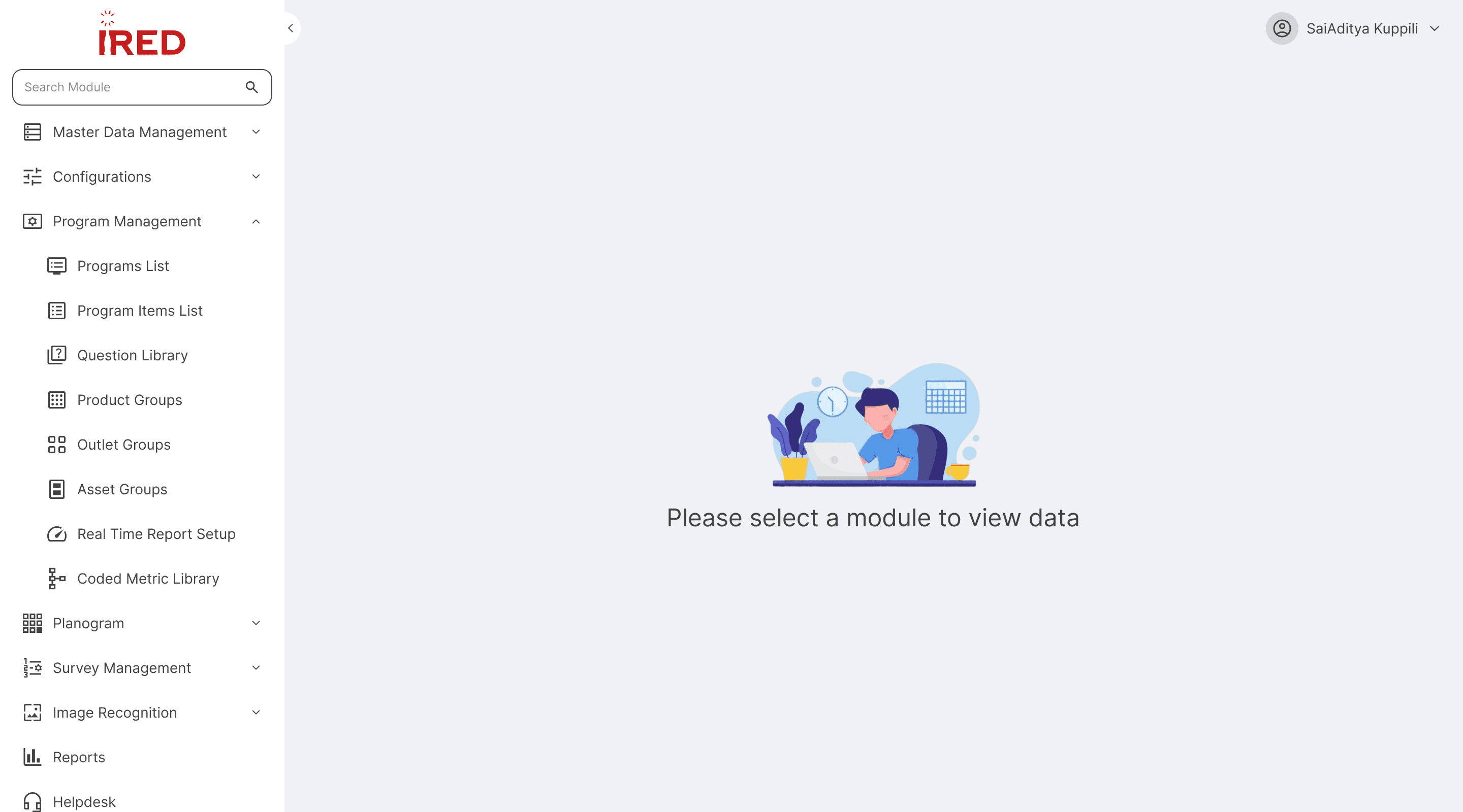
An illustration was added to the landing page alongside supporting copy. The prompt reads 'Please select a module' rather than 'Please search for a module' — a deliberate choice by the team to encourage users to learn the navigation structure, which also makes it easier for them to reference module paths when submitting support tickets.
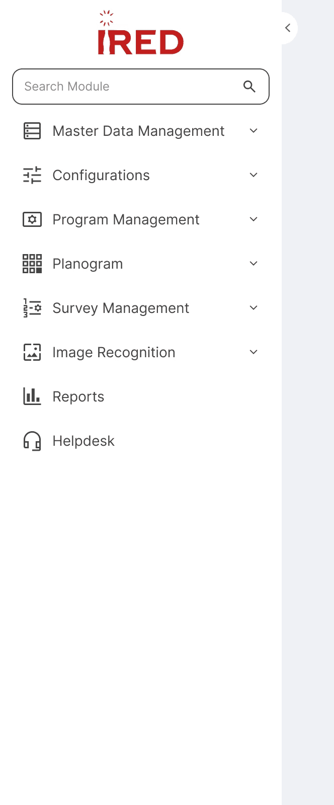


Components
Considering the better flows from wireframes, I have started working components required to create new sidebar including Icons, Logo, Search states, Menu states.


Menu(All States)
Though the existing users will be taking time to adoption of search, the navigation still increases the overall discoverability and easy navigation to the users.
⚖️ Key Trade-off: Real-time Search vs. 3-Character Minimum
Engineering advocated for real-time search to feel "modern,"but testing showed 1-2 characters returned 47+ results,causing scanning overhead.
Decision: 3-character minimum with smart messaging
Result: Search time reduced from 15s → 6s
Usability Testing -IA
After increasing the minimum search character count to 3 and retesting, we observed a clear improvement in discoverability.
Open Survey Review
Discoverability
Easy
Finding from Drill Down
0m 20s
Search With Min 3 Character
0m 6s
Open Planogram UPC Report
Discoverability
Easy
Finding from Drill Down
0m 24s
Search With Min 3 Character
0m 4s
Open IR Self Quality Check
Discoverability
Easy
Finding from Drill Down
18s
Search With Min 3 Character
0m 7s
Discoverability improved significantly for returning users and those who already knew their module names. However, discoverability remained somewhat challenging for brand-new users — a known trade-off addressed in the V2 roadmap.
Metric
Time on Task
(reduced by >88%)
Key Benefit
Improved Employee Productivity & Higher System Adoption
Business Impact
Time on Task Reduced by >88%
The navigation redesign unlocked nearly $553K in annual value through combined productivity gains and support cost reduction. More importantly, it transformed how our operations team works: eliminating the need for workarounds, reducing cognitive burden, and enabling us to scale our headcount without proportionally increasing training costs. This project demonstrated how strategic UX investments directly impact the bottom line.
Adoption & Impact
Within 30 days of launch:
85% of users adopted search as their primary navigation method
Navigation-related support tickets dropped 67%
Portal satisfaction scores increased from 4.2 to 7.8/10